Create
cancel
Showing results for 
Search instead for 
Did you mean: 
Sign up Log in

📣 A new look for the Rule Builder for Automation is coming soon ⚡️

Hey Community 👋, Simon Chan from Automation Platform here.

I am stoked to be announcing that a new look for the Rule Builder for Automation will start rolling out this week. Becoming generally available later this year, the new Rule Builder has all the same functionality, but gets a fresh new look that makes it easier to use. And it's all thanks to your feedback! So let’s dive in and get you across all the details.

1️⃣ More space for your rule flow
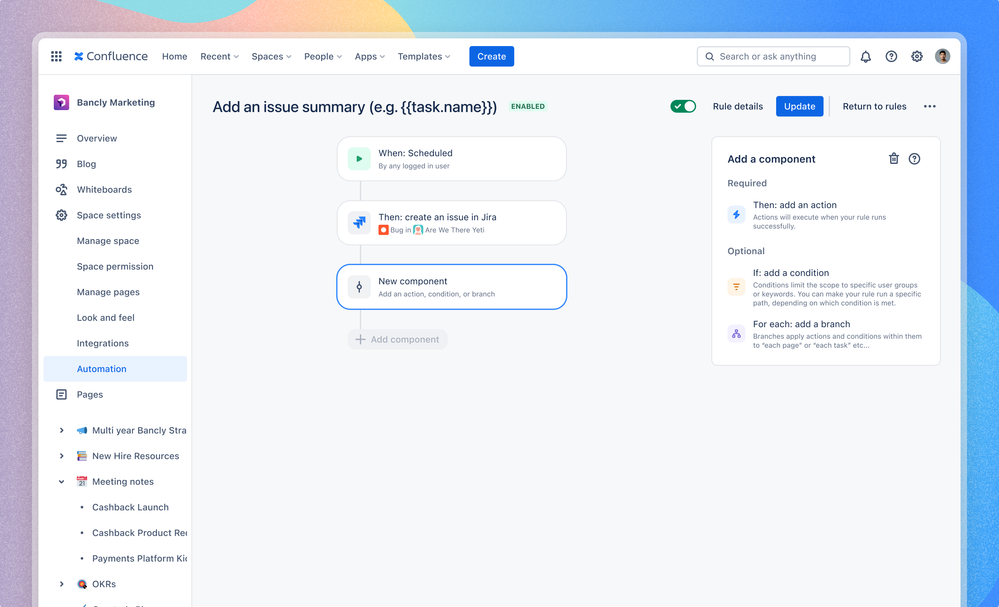
image-20231013-234038.png

Whether you’re a seasoned Automation pro or just getting started, we’ve made it easier to create and edit your rules. By making the rule flow the star of the show, you can see and understand everything that’s happening in a rule. Just like in the current rule builder, you can add components sequentially via the ‘Add component’ button, or add them in-between existing components by clicking. If you’ve already configured your components, you can drag and drop to reorder the steps in your rule.

2️⃣ Less scrolling and better branching

image-20231016-224713.png

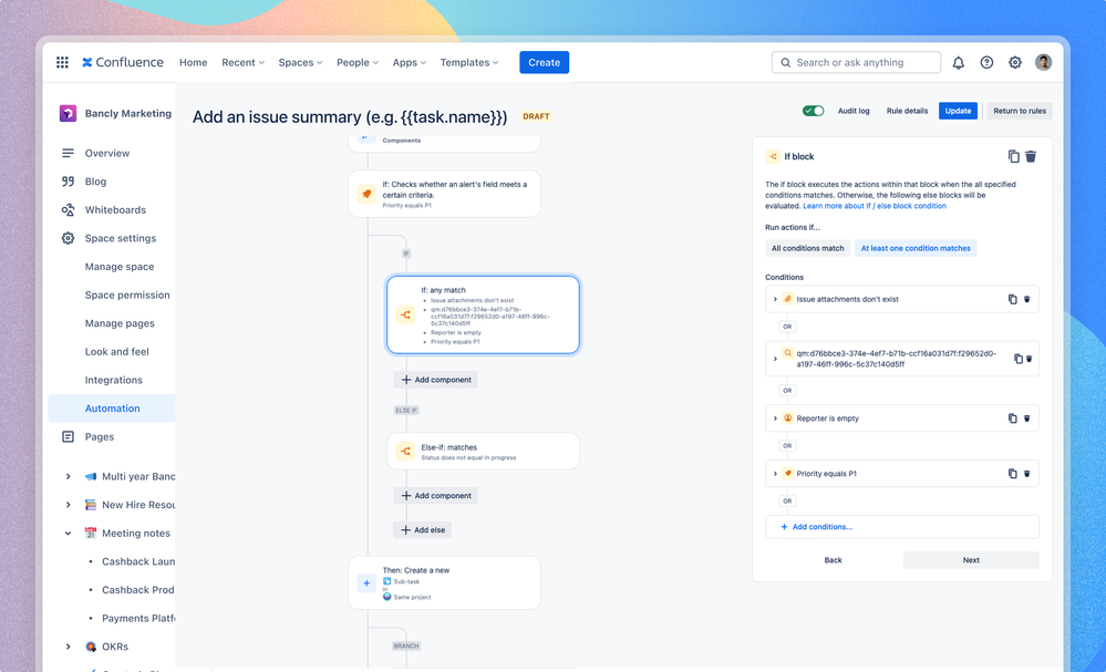
Component details has now moved into the right side bar, and it’s now always visible. No matter how many components your rule has, it always will be there by your side, so you don’t have to scroll up and down the entire page to know if you’re editing the right component in a long rule. We’ve also given branching a refresh, with lines to make it clear where a if/else or branch occurs in your rule flow.


3️⃣ Everything you need, in one place

e4fd29b2-330e-41af-a1b9-0197a9f44acb-20231016-230538.png

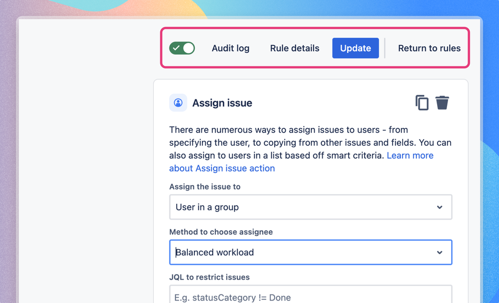
We’ve heard that it’s easy to forget to save a rule, and then changes are lost. To make it easier, we’ve placed the Turn on rule and Update (shown when editing an existing rule) buttons on the top right of the rule builder. They’re always there so if you have to run to a meeting mid-edit you can easily hit Update to make sure your work is saved. You’ll also find the Audit Log, Rule Details, and options to toggle rules on or off in the same place.


When will the new look Rule Builder be available?

The new look Rule Builder will start gradually rolling out today across Jira, Confluence, Jira Service Management and Jira Work Management to all editions where Automation is currently available. We expect the rollout to be complete and for the new look Rule Builder to be available in all products by the end of this calendar year.


We want to hear from you

Before we sign off, thank you for sharing your feedback here in the Community and for getting on calls with us to share your experiences with Automation. We hope you’ll love the new look Rule Builder. If you have questions or want to share your thoughts, drop a comment below, jump on a call with us or share feedback directly from within the new look Rule Builder.

14 comments

Dan Tombs
Community Leader
Community Leader
Community Leaders are connectors, ambassadors, and mentors. On the online community, they serve as thought leaders, product experts, and moderators.
October 18, 2023

Great to see these improvements come to fruition. Seeing the rule flow larger and with clearer lines should really help debug any errors we see.

Like # people like this
Tomislav Tobijas
Rising Star
Rising Star
Rising Stars are recognized for providing high-quality answers to other users. Rising Stars receive a certificate of achievement and are on the path to becoming Community Leaders.
October 19, 2023

Looking great! 🤩

Just to confirm, this refreshed look will also be available for Automation for Jira? (just asking as screenshots show Confluence automation, but by the looks of the article labels, this should also apply to Jira).

Like Simon Chan likes this
Simon Chan
Atlassian Team
Atlassian Team members are employees working across the company in a wide variety of roles.
October 19, 2023

Hey @Tomislav Tobijas 
Thanks for the feedback! Yes, confirming that the refreshed look will be coming to Automation for Jira (Jira Software, Jira Service Management & Jira Work Management) too!

Like # people like this
Hana Kučerová
Community Leader
Community Leader
Community Leaders are connectors, ambassadors, and mentors. On the online community, they serve as thought leaders, product experts, and moderators.
October 25, 2023

Nice, thank you!

Like Simon Chan likes this
Haddon Fisher
Rising Star
Rising Star
Rising Stars are recognized for providing high-quality answers to other users. Rising Stars receive a certificate of achievement and are on the path to becoming Community Leaders.
November 21, 2023

Got this UI recently in my personal instance, and have a lot of mixed feelings.

The pure usability changes do feel like an improvement; rearranging the save\publish buttons and moving the components section feel like a good changes and the click-and-drag also feels much smoother. Visually, I really like that the branching is more obvious.

Unfortunately there's a lot to not like as well. The biggest one I see off the top of my head is the new component edit screen, which is much smaller. This is the most important screen in the majority of Automation use-cases, so making it so much worse for so little gain is not a choice I understand, given the amount of whitespace surrounding the components now. Even some of the wins are only partial; while the branching visuals are improved for the purple components, it wasn't extended to the "If\Then\Else" condition, which now has an even odder look.

The last piece of feedback I want to give is becoming a bit of a broken record at this point but...are UI improvements really the best use of your time right now? Even if you zoom into just the Automation piece, the visual interface is good enough that you've rolled out changes to get us to use it less, and it's not like there aren't a ton of feature requests, bug fixes, and enhancements people have been asking for. Putting all of that aside, "UI change fatigue" is a real thing whose credit line been overextended for a while now.

Signed up for a session, so talk to you soon!

Like # people like this
Simon Chan
Atlassian Team
Atlassian Team members are employees working across the company in a wide variety of roles.
November 22, 2023

Hey @Haddon Fisher, first off thanks for taking the time to share your feedback with us and looking forward to catching up with you next week.

On the component edit screen, we hear you and have received similar feedback from some other customers and will be rolling out changes to make it wider shortly - would love to know if the changes help once you've been able to use them. More broadly, we've made these changes primarily as we saw increased feedback around the core usability of the rule builder, but also to set us up to deliver future updates to allow creation of more complex rules. We are also working to broadly make performance enhancements across the board and address bugs more swiftly, but I do understand how it may appear in light of the packaging model changes.

Haddon Fisher
Rising Star
Rising Star
Rising Stars are recognized for providing high-quality answers to other users. Rising Stars receive a certificate of achievement and are on the path to becoming Community Leaders.
November 22, 2023

Hi Simon Chan, thanks for the quick reply and glad to hear the component window is getting attention ASAP. Any idea when I'll see it hit the wild?

I definitely understand wanting to make changes to the UI as you set yourselves up for future improvements and it's not my place to tell you how to do Product. It's also possible that I am the one lone nut in a sea of happy people. However that lone nut's well of tolerance for small and not-overly-valuable UI changes in Jira went dry a couple years ago; the fact that we keep getting these instead of what is actually asked for is salt on the wound, and that's before we get into choices like the packaging model changes.

Anyway, thanks again for the quick reply and talk to you soon!

Rick Westbrock December 11, 2023

Isn't this being rolled out to sandbox tenants? We saw this hit our production tenant quite some time ago but as of today our sandbox tenant still has the old UI.

Bill Sheboy
Rising Star
Rising Star
Rising Stars are recognized for providing high-quality answers to other users. Rising Stars receive a certificate of achievement and are on the path to becoming Community Leaders.
December 11, 2023

Hi @Simon Chan 

Thanks to the team for continuing to improve automation rules!  Here is my feedback on the changes...

tl;dr: This new UX seems to target an audience of people new to creating rules rather than experienced rule writers, engineers, and Jira admins.  I envision after less-experienced users become accustomed to rule creation, they will be frustrated by the reduced productivity of this new UX.

For more details:

  • Big take-away: the rule is no longer displayed side-by-side with the audit log.  This makes it more difficult to compare the results in the log to the components used.  (Although it was already challenging as some things in the audit log do not appear in the same order as in the rule; this can be the case even for sequential steps, not parallel ones like branches.  But that is a rule engine issue :^)
  • The rule builder contents (i.e., components) are quite small, making it more difficult to see them.  A browser's zoom must be increased to be comparable to before. 
  • There appears to be quite a bit of wasted, horizontal screen space, making me wonder if the designed breakpoint was for tablets or other hand-held devices, and so not responsive to monitors or laptop screens.
  • There seems to be wasted, vertical space with the new way to display the branches and if / else conditions.  My hypothesis is there was some feedback that people did not understand the linear flow (or indentation) well and so the extra space was added to help.  An alternative design could have shaded a logical block of components when under focus, eliminating the need for the vertical spacing.
  • It appears there is no longer a way to add a component between two existing rule components.  Instead a new component must be added to the end, and dragged and dropped, or duplicated from another component, and then dragged.  This one is definitely a productivity-reducer for experienced rule writers.  UPDATE: Found it, and the add is just less obvious as the connecting lines must be hovered over for a moment longer.
  • I like the new list / filtering for rule component selection...and, I would still like to see "pinned" components for users to pin frequently used ones, rather than a "Recommend" list.  (I suggest this idea periodically, hoping it will get added :^)
  • Improved rule validation before saving an component seems better, however...
  • The new wizard-like steps to add a component to a new rule will slow down rule creation, adding clicks, and eliminate different ways people create rules. 
    • This seems linear / sequential thinking, versus those who may quickly add a trigger, add the action-oriented components (at the end) and then fill in the middle with conditions, branches, etc.
    • Another example: I cannot add a branch referencing data which I have not yet added to the rule, and then later add components above it to drive the branch; instead the new validation must pass and I must select "Next".  (e.g., for an advanced branch driven by earlier list data).  Perhaps instead the validation could happen, show as an error, and let the user proceed.  Only at rule publish with the save halt due to errors.

Thanks again to the team for working to improve the automation rules engine and builder.  I look forward to future improvements.

Kind regards,
Bill

Like Haddon Fisher likes this
Florent Honoré December 14, 2023

@Rick Westbrock In our case it's the other way around, our Sandbox has the new UI but not production. I would guess they are still in the rollout process and they are targeting sandbox and production alike without any priority.  

Like Dan W likes this
Rick Westbrock December 14, 2023

Yesterday afternoon I did discover that our sandbox tenant finally has the new UI.

I definitely do not like how narrow the details section for the actions is, I would prefer if that section dynamically resized with the browser window size.

Like ADM Botond likes this
Haddon Fisher
Rising Star
Rising Star
Rising Stars are recognized for providing high-quality answers to other users. Rising Stars receive a certificate of achievement and are on the path to becoming Community Leaders.
January 11, 2024

Just got the new UI in our production instance, and uh....not gonna lie Simon Chan I am not sure I see most of the usability improvements you mentioned were in the works.

I do see that the "Scheduled" component text isn't stepping on itself in its smaller box anymore, which is nice. I don't know if it came up in our convo, but I must admit I also like the new visual style...it looks a little sleeker than the old one.

There does not appear to be any adjustments made to the component tree however, which still has no business being as big as it is. As far as I can think, it has literally two jobs: "tell us the order of the components" and "illustrate what components are operating in the main line versus in a branch".

The components themselves, on the other hand, are where people writing rules spend 99.9999% of their time. Even if they weren't spending all their time there, it's almost always going to contain more content than the tree...I'm on a 14" Macbook Pro, and so far I haven't found a component I don't need to scroll in to get to the bottom of. I did find a couple after all so I can't honestly say this anymore. I will say I don't spend a lot of time in "Lookup" or "Advanced Branching" though.

If you're committed to this look, then at least give us the ability to expand the component details out. It'll still be annoying but at least it'll be a bit more usable.

Like # people like this
Julia Foden January 12, 2024

I got the new UI two days ago and I don't like it at all. As other people have mentioned, there's a lot of wasted space; the component edit area (where we are doing the actual work!) is smaller; and it seems like it's designed for beginners making very simple rules.

But the worst thing for me is that when editing a component you have removed the Save and Cancel buttons. I find this unbelievable! Everywhere else in Jira, whether it's adding a comment, editing a workflow, creating a field . . . there is always a main button like Save/Update/Publish and a less prominent Cancel button. But now with editing a component in automation the only buttons are Back and Next. What do they even mean? Does Back mean Cancel??? I can't believe I am asking this question. It appears that Back does not mean Cancel, and that the default behaviour after opening a component and (possibly inadvertently/mistakenly) making an edit is that this edit goes into the bundle of edits to be applied when you Update/Publish the rule. This is the opposite of the previous behaviour where you had to actively Save every component edit and then Publish the rule. But there's no warning/information to users about this!

I am horrified by this really. Automation is very powerful (that's why we love it!) but for those of us with complex rules this auto-save of edits is dangerous. What is the advantage of removing Save and Cancel in components? Can you add them back?

Like ADM Botond likes this
Mullin, Joe February 7, 2024

Not having the search field and no key words of "Assets" on any of the conditions threw me for a loop.

Comment

Log in or Sign up to comment
TAGS
AUG Leaders

Atlassian Community Events