A pop-up survey could appear while you're here --curious what it's for? Click here to learn more!
×Community resources
Community resources
Community resources
Scatter Plot Chart in Jira
Ever feel like you’re swimming in a sea of data, unsure of how to turn those numbers into real, actionable insights? That's where the mighty scatter plot chart comes in, ready to make your life so much easier.
In this article, we will explore what a Scatter Plot is, examine and analyze examples of Scatter Plot Chart and discuss how it can be created using the Time Metrics Tracker.
🔍 What is a Scatter Plot Chart?
A Scatter Plot Chart is a visual representation that uses dots to show the relationship between two variables. Each dot on the chart represents an individual data point. Scatter plots are often used to identify correlations, patterns, and trends in data sets, helping teams make data-driven decisions.
Let's get straight to the practice. We'll consider this simple diagram, draw conclusions from it, and understand how it can be used in Time in Status Jira metrics. We will not discuss Kamala and Trump here, but we will focus on the already assessed data from 2020.
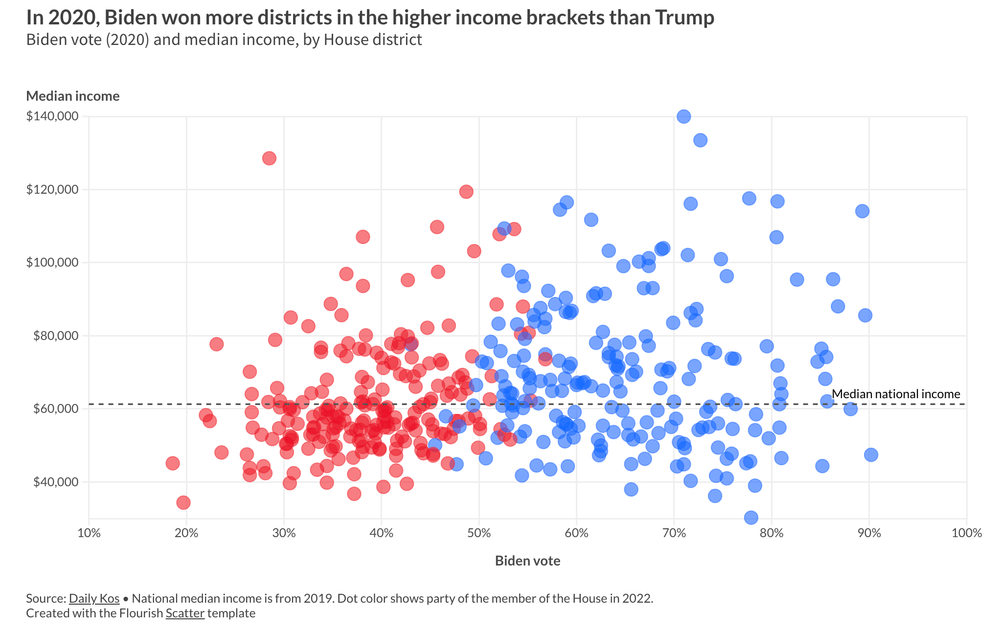
Explanation of the Scatter Plot: Biden Vote (2020) vs. Median Income by House District
This scatter plot visualizes the relationship between Biden’s vote share in the 2020 U.S. presidential election and the median income of voters in different House districts. Here’s a breakdown of what the chart shows:
📊 Axes Explanation:
- X-axis (Biden Vote Share): This axis shows the percentage of votes that went to Biden in each House district, ranging from 10% to 100%.
- Y-axis (Median Income): This axis represents the median income in each district, ranging from $40,000 to $140,000.
🔵🔴 Data Points and Color Coding:
- Red Dots: Districts where Trump won more votes.
- Blue Dots: Districts where Biden won more votes.
- Each dot represents a House district, with its position showing the district's median income and the percentage of the vote that went to Biden.
🏛️ Key Insights:
- Income Trends and Voting Patterns:
- Districts with higher median incomes (above the median national income line) tend to have more blue dots, indicating a stronger preference for Biden. This suggests that Biden generally won more support in wealthier districts.
- Districts with lower median incomes (below the median national income line) have more red dots, showing a stronger preference for Trump. This suggests that Trump performed better in areas with lower median incomes.
- Cluster Analysis:
- There is a dense cluster of red dots around the lower and middle income brackets, indicating that many districts with lower to average income levels leaned toward Trump.
- Conversely, the blue dots become more prominent as you move to the higher income brackets, indicating Biden’s stronger performance in wealthier districts.
- Highlighted Data Point (CA-12):
- The highlighted point represents California's 12th House district, where Biden received 89.3% of the vote, and the median income was $114,085. This is a clear example of a wealthy district that heavily favored Biden.
🧩 Overall Interpretation:
This scatter plot serves as a powerful example of how data visualization can uncover patterns and correlations in complex datasets. In the case of the 2020 election, we see a significant trend: Biden won more districts in higher income brackets, while Trump had stronger support in lower and middle-income districts. This suggests that income levels may influence voting preferences, highlighting the power of scatter plots to provide insights into social and economic behaviors.
📈 How This Relates to Scatter Plots in IT:
The example of the election scatter plot demonstrates how effective scatter plots can be in revealing relationships between variables. In the IT and agile project management world, scatter plots are just as useful. They can help teams visualize key metrics like Cycle Time and Lead Time, offering actionable insights into workflow efficiency.
Cycle Time and Lead Time in Scatter Plots:
- Cycle Time: In Jira, Cycle Time measures the total time taken from when a task begins to when it is completed. A scatter plot can display individual tasks as dots, with the x-axis representing task complexity (like story points) and the y-axis representing Cycle Time. This helps agile teams understand how task complexity impacts delivery time and spot patterns or outliers that may indicate inefficiencies.
- Lead Time: Lead Time measures the duration from task creation to task completion. By plotting Lead Time data, teams can analyze how quickly tasks are addressed from initial request to delivery. For example, a scatter plot showing Lead Time vs. task priority can reveal if higher-priority tasks are being completed faster or if there are delays that need to be addressed.
🔍 Practical Applications for Agile Teams:
- Identifying Bottlenecks: Similar to how the election scatter plot shows income-based voting trends, an IT scatter plot can highlight workflow bottlenecks. If certain tasks consistently take longer, teams can investigate why and make improvements.
- Data-Driven Decision Making: Scatter plots help teams make informed decisions. For example, if a trend shows that higher complexity leads to disproportionately longer Cycle Times, Scrum Masters can adjust sprint planning to better allocate resources.
📊 Why Use a Scatter Plot Chart?
- Visualize Relationships
- Scatter plots help teams see if there's a relationship between two variables, such as effort vs. outcome or sprint duration vs. completion rate.
- 📈 Use them to find correlations, like whether more development time leads to higher feature quality.
- Identify Trends and Outliers
- You can quickly spot trends, such as an increase or decrease over time, or outliers that may require a deeper investigation.
- 🔍 For Scrum Masters, this is crucial to understand the impact of changes in team processes on delivery performance.
- Optimize Sprint Planning
- By visualizing data like story points vs. actual time spent, Scrum Masters can optimize future sprint estimates and improve the team's forecasting.
- 🚀 Scatter plots can reveal inefficiencies or help fine-tune task distribution among team members.
- Track and Evaluate Performance
- When paired with agile metrics, Scatter Plot Charts can provide a snapshot of team performance. This insight is beneficial for continuous improvement.
👥 Who Uses Scatter Plot Charts?
- Scrum Masters and Agile Coaches
- They use Scatter Plot Charts to analyze team productivity and guide retrospective discussions.
- 🎯 Goal: Improve sprint planning, resource allocation, and team performance.
- Project Managers
- Project Managers use these charts to understand project risks and evaluate the impact of changes on the overall delivery timeline.
- 📝 They can track how different factors (like scope changes) affect team velocity.
- Development Teams
- Developers may use Scatter Plot Charts to understand the relationship between code complexity and bug frequency, leading to higher quality outputs.
- 🔧 Helps in pinpointing areas that may require refactoring or additional testing.
- Business Analysts
- Analysts leverage Scatter Plots to validate assumptions and ensure that the project outcomes align with business goals.
- 📊 Use it for strategic planning and measuring the ROI of development initiatives.
📊 What is the Scatter Diagram Used For?
A scatter diagram (another name for a scatter plot) is used to:
- Examine the strength and direction of a relationship between two variables.
- Determine if a linear or non-linear relationship exists.
- Validate hypotheses or assumptions in research or statistical analysis.
- Understand whether a change in one variable affects another variable.
🧐 How to Interpret a Scatter Plot Graph?
- Look for Correlation Patterns:
- Positive Correlation: As one variable increases, the other also increases. The dots trend upward.
- Negative Correlation: As one variable increases, the other decreases. The dots trend downward.
- No Correlation: The dots are scattered randomly, indicating no clear relationship.
- Analyze the Spread:
- If the dots are closely packed, the relationship is strong.
- If the dots are widely scattered, the relationship is weak.
- Spot Outliers:
- Identify any dots that don’t fit the overall pattern, as these could indicate anomalies or special cases worth investigating.
Jira's Built-In Control Chart
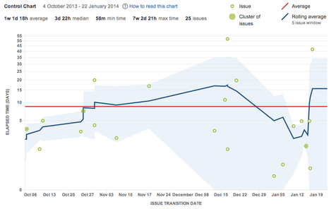
Control Chart is a tool that provides a scatter plot-like visualization, but it displays only the Cycle Time for issues over a specific period. Also comes with some limitations that may not suit every team:
- Limited Customization: The Control Chart lacks flexibility when it comes to selecting or filtering specific data points, such as custom metrics or additional variables (e.g., task complexity or team member performance). If you want to compare multiple factors or customize your data view, the Control Chart falls short.
- Focus on Stability: The Control Chart is primarily designed to show process stability rather than detailed relationships between variables. This makes it less helpful for teams who need to explore how different factors impact performance, such as how story points influence Cycle Time.
- Harder to Extract Insights: For teams that need to export data for further analysis or create more visually engaging charts, the Control Chart is limiting. It doesn’t allow for easy data export to Excel for deeper analysis, making it difficult to generate comprehensive scatter plots.
📝 How to make a precise data Scatter Plot Diagram?
If you’re using Jira, the way to analyze and visualize your team's performance can be by leveraging Time Metrics add-on. Add-on effortlessly tracks crucial metrics such as Cycle Time, Lead Time, Time in Progress (any time based metric you need). Once it is installed, you can export data and build a scatter plot in Excel to uncover valuable insights. Here’s how to do it:
1.Set Up the Time Metrics Tracker Add-on:
- Install Time Metrics Tracker and configure it to measure the specific time metrics relevant to your workflow, such as Cycle Time or Lead Time.
2. Generate and Export Your Data:
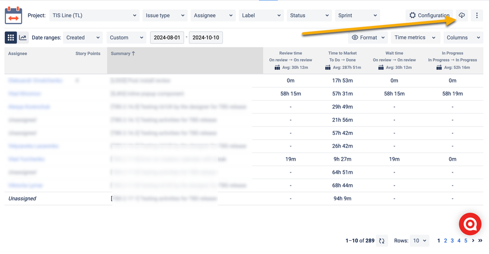
- Use the add-on to create a detailed report of the metrics you’re interested in analyzing.
- Export the report in XLS or CSV format, making it easy to use in Excel.
3. Import Your Data into Excel:
- Open Excel and import the exported data.
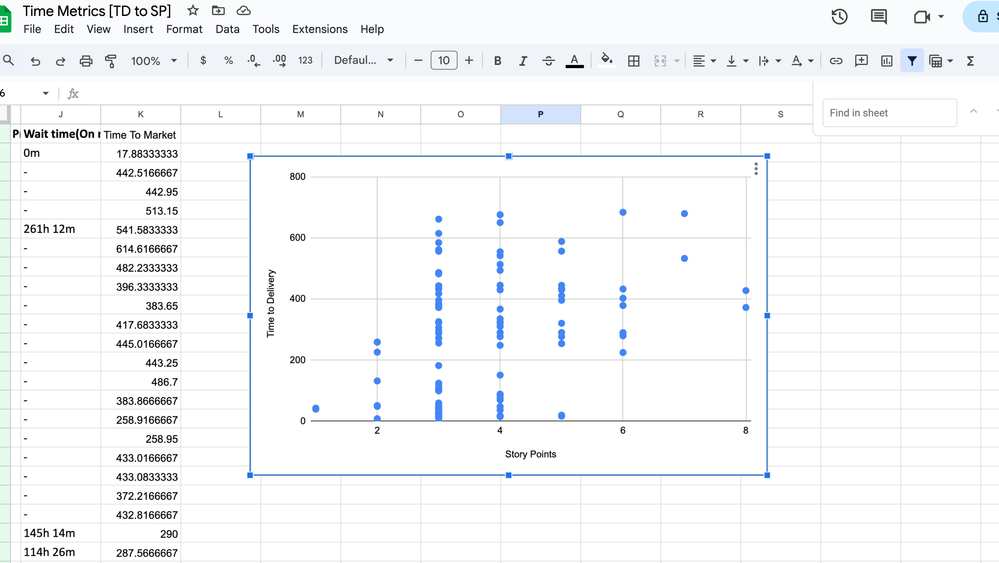
Make sure you have two key data sets you want to analyze, such as Task Complexity (e.g., Story Points) on the x-axis and Cycle Time on the y-axis.
4. Create the Scatter Plot:
- Highlight the relevant columns of data.
- Navigate to the Insert tab in Excel, click on Scatter Chart, and select your preferred scatter plot style.
- Excel will generate a scatter plot, where each dot represents a Jira issue.
5. Analyze Your Scatter Plot
Examine the scatter plot for clear patterns. For instance, observe if tasks with higher Story Points generally have a longer Time to Delivery.
- Identify Variability: Check for instances where tasks with the same Story Points have widely varying Time to Delivery. This could highlight inefficiencies, inconsistencies in execution, or potential bottlenecks in your workflow.
- Spot Outliers: Look for outliers—those tasks that take significantly longer to complete than others of similar complexity. These may point to issues like underestimations, unexpected challenges, or external factors causing delays.
6. Use Insights to Improve Team Performance
- If you notice that lower-complexity tasks (fewer Story Points) are taking as long as or even longer than more complex tasks, investigate possible bottlenecks, such as delayed code reviews, lengthy approvals, or waiting for dependencies.
- Refine Sprint Planning: Use this data to fine-tune how your team estimates Story Points, ensuring they more accurately reflect the actual effort and resources needed.
- Optimize Workflow: Address identified delays and streamline processes to ensure faster and more consistent delivery, ultimately boosting team efficiency and predictability.
Takeaway
With the ability to identify bottlenecks, refine sprint planning, and improve overall efficiency, you’re not just managing your projects—you’re leading your team toward continuous improvement and greater success. So, take control of your data, visualize your progress, and watch as your agile processes become more effective and predictable. Remember, every dot on that scatter plot tells a story, and with the right tools, you have the power to shape that story into one of growth and achievement.
Was this helpful?
Thanks!
Vitalii_Bobak_SaaSJet
About this author
Manager of Customer Success – SaaSJet
5 accepted answers





3 comments