Community resources
Community resources
Community resources
A powerful Reported vs Done chart for Jira dashboards
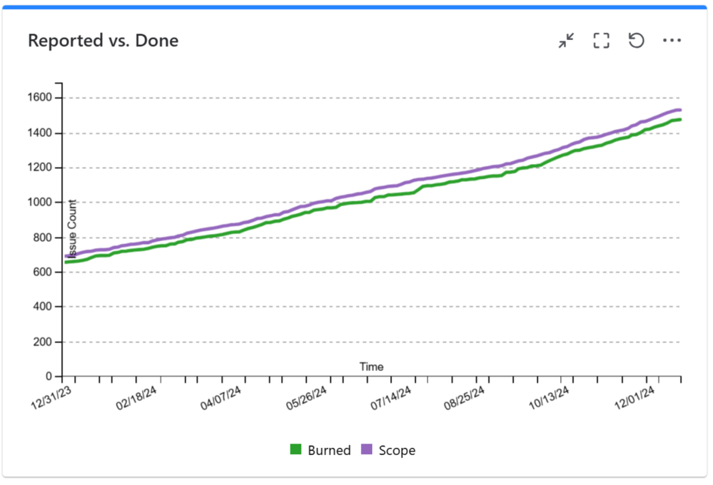
A Reported vs Done chart tells you how your team handles the workload in time. It gives you a clear indication if your team manages to resolve issues fast enough for maintaining the backlog size in acceptable limits.
Such chart is a “must have” on the monitoring dashboard of any support team because it shows potential team capacity problems, overloading periods or poor team performance that might require corrective actions. Don’t have it yet? See below how to add it to your Jira dashboard.
Great Gadgets app for Jira offers a gadget that you can use to display a Reported vs Done (or Reported vs Resolved) chart on your Jira dashboard. And it is a powerful gadget because it has some key-features:
- The chart is based on a Jira issue filter or JQL, which means that you have full flexibility about what issues to track in the chart
- You can generate the chart not only by Issue Count, but also by sum of Story Points, Original Time Estimate or by any other numerical custom field defined in your Jira instance. This is useful if the issues in your backlog do not have the same size / weight.
- The gadget settings allow you to select a time interval and the chart lines do not start from zero but from the actual values at the beginning of the interval
Assuming that you already have Atlassian Jira in-place, follow these steps to configure and display the chart on your Jira dashboard:
- Make sure that you have the latest version of Great Gadgets installed in your Jira instance. If not, you can install the app from Atlassian Marketplace: https://marketplace.atlassian.com/search?query=stonikbyte+great+gadgets
- Create a new filter in Jira (or use an existing one) that includes the Jira issues that you want to track. It must include the resolved issues.
- Decide on which Jira dashboard you want to add the chart. Create a new Jira dashboard or choose an existing one.
- Add the Release Burndown Burnup Chart gadget (yes, the name Release Burndown Burnup Chart is correct) to your Jira dashboard by clicking the Add Gadget button from your Jira dashboard and then by selecting and adding the Release Burndown Burnup Chart gadget.
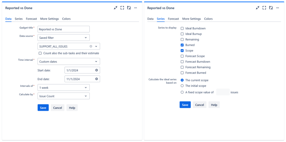
- Configure the gadget. At Data source, enter the filter that you created before. As you can see, the Intervals of length is configurable and you can choose to calculate by Story Points, Issue Count, Original Time Estimate or by any other numerical custom field defined in your Jira instance.
- At series to display in the Series tab, choose to display only Burned and Scope.
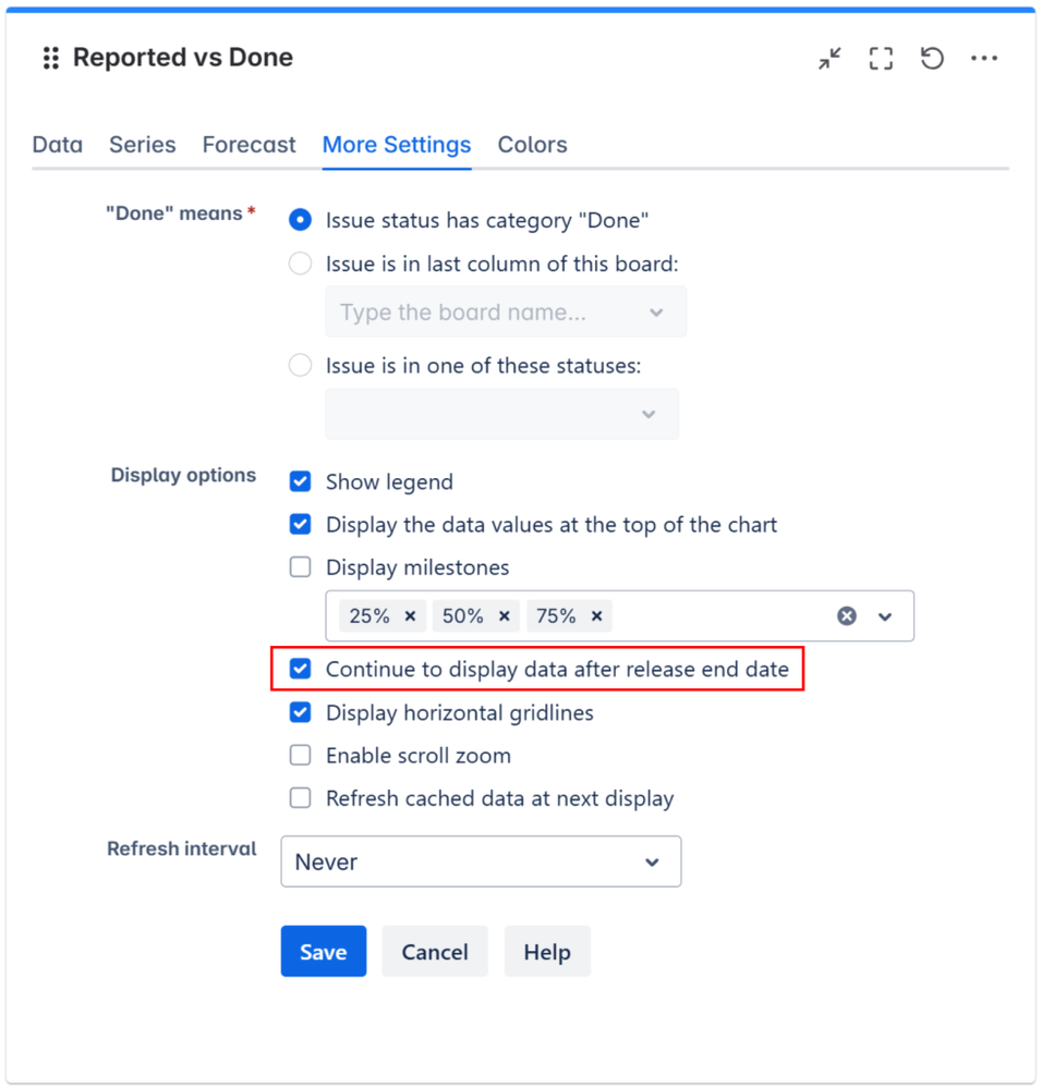
- In the More settings tab, make sure to check the option Continue to display data after release end date
That’s all! Click Save. The gadget should now display the Reported vs Done chart on your Jira dashboard.
If you have further questions, don’t hesitate to contact support@stonikbyte.com.
Was this helpful?
Thanks!
Danut M _StonikByte_


0 comments