Community resources
Community resources
When It Comes to Knowledge Management, Don't Say It — Show It.
I like working on Gliffy because I believe visuals are a super powerful way to communicate. With all the conversation about Knowledge Management in Confluence taking place in the community, I wanted to share a few ideas and encourage you to make flowcharts, diagrams, and other visuals your secret weapon.
Sparknotes: Add visuals to your knowledge management tools, self-service help portals, and documentation because:
- They are skimmable; users can quickly assess whether the content will answer their question.
- They are memorable; visuals are “sticky” in that your viewers will remember what they saw.
- They are accessible; showing a concept graphically can make it more understandable — great for users who need a high-level understanding, but also leaves users able to dig into more detail as well.
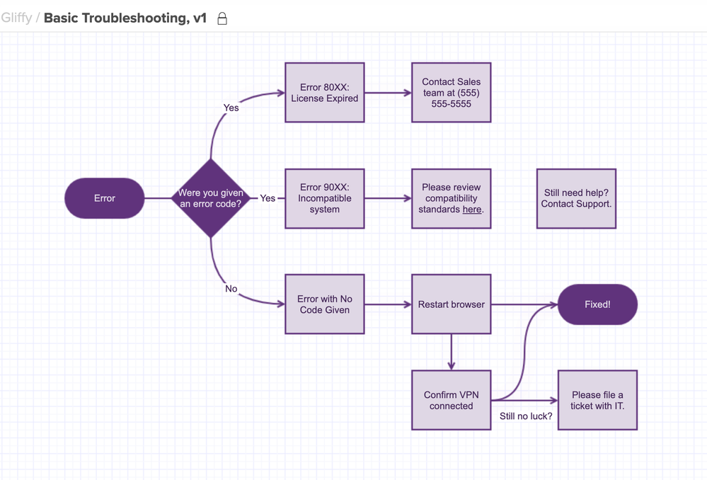
Use Flowcharts to Explain Processes, Basic Troubleshooting Steps, and More
When possible, many users indicate that they’d rather find the information to solve a problem themselves than open a ticket with a support team. By creating easy-to-follow, step-by-step documents in your site’s Help sections, you can help your users find the answer or troubleshoot against a common problem, giving your support team a breather.
Tip: Work with your support team to identify the most common questions and issues your customers are running into. If there’s a common fix, try to represent it in one of these flowcharts! Depending on how complicated that process is, you could also break it out into its own “solution” diagram.
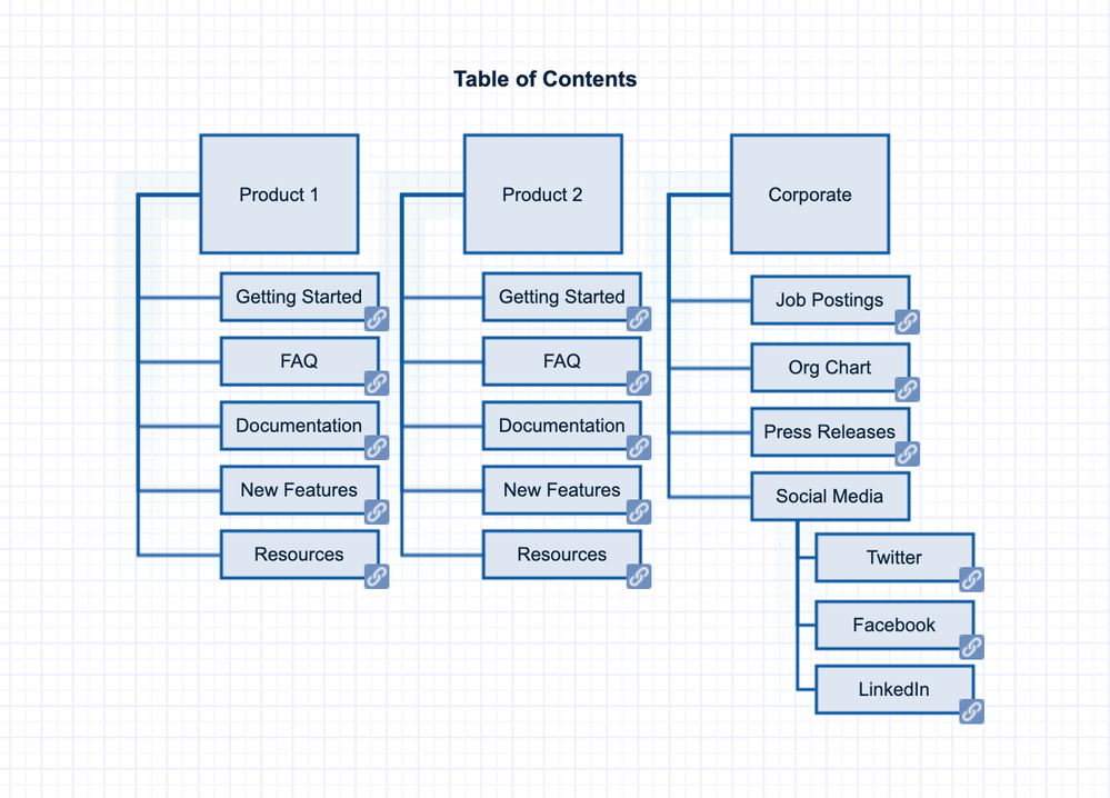
Make a Visual Site Map or Table of Contents to Help Users Navigate
You could stash all the info in the world in your knowledge base. But, if it’s buried in a table of contents or a mile-long FAQ, your team or users won’t be able to track it down when they need it most. By including a visual site map or table of contents graphic (and linking to those pages!), you can essentially create the ultimate guidebook to all the information you’ve collected.
Tip: Adding links to pages in this diagram will help your users navigate quickly.
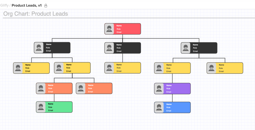
Add Org Charts to Help Identify SMEs or Key Contacts
If you’re part of a growing team or a large organization, understanding who to reach out to with further questions can be a hurdle. By adding Org Charts with contact info for specific experts within your company, you can help your users get to know the experts.
Tip: You could also use Gliffy’s “pop up notes” function to display more info when a user hovers over the name of one of their colleagues.
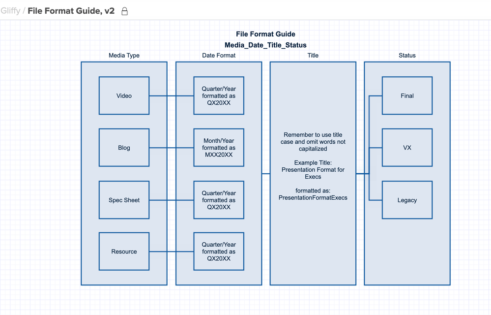
Create and Share Rules for Your Knowledge Base’s Structure
Meta, right? 😉 One of the challenges of managing all this information is simply structuring it in a way that makes it easy to navigate and consistent as it grows over time. Creating a flowchart to track naming conventions or identify the right places to put information will help your structure ultimately stay in place.
Get Started with Gliffy
If your team doesn’t yet have a diagramming tool, I made all of the above with Gliffy! Its best feature is the ability to link to other pages or diagrams from within a diagram — which makes all the ideas above really useful. That native Confluence integration makes all the difference. Like every app in the Marketplace, you can give it a try for free.
How Has Your Team Used Visuals?
I’m super curious if your org has done any of the above or something totally new to create more visual resources in your wikis or support systems. How did it work? I’ll give you extra credit if you drop in an example!
Samie
Was this helpful?
Thanks!
Samie Kaufman - Your Gal at Gliffy

About this author
Product @ Gliffy
Perforce Software
Minneapolis, MN
22 accepted answers
TAGS
Atlassian Community Events
- FAQ
- Community Guidelines
- About
- Privacy policy
- Notice at Collection
- Terms of use
- © 2024 Atlassian


0 comments