Create Sign up Log in
Turn on suggestions
Auto-suggest helps you quickly narrow down your search results by suggesting possible matches as you type.
Showing results for
Community resources
Community resources
- Community
- Products
- Jira Software
- Questions
- Why is the Y-achsis of my cummulative workflow diagramm not equally distributed?
Why is the Y-achsis of my cummulative workflow diagramm not equally distributed?
Hello :)
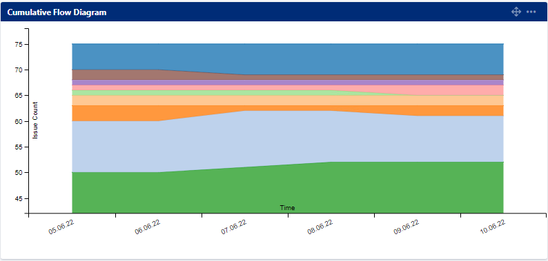
The Y-achsis of my diagramm is not equally distributed and therefore distorts the message. It looks like the progress is much worse than it actually is (done: 59/75 -> There should be a lot more green) Is there a way that i can change this view?
1 answer
Bill Sheboy
Rising Star 
June 10, 2022 edited 
Rising Star
Rising Stars are recognized for providing high-quality answers to other users. Rising Stars receive a certificate of achievement and are on the path to becoming Community Leaders.
Hi @Kathrin -- Welcome to the Atlassian Community!
Atlassian's interpretation of a Cumulative Flow Diagram (CFD) draws the data based upon the currently viewed date/time range and filter.
- So it only draws the bands correctly and in proportion to count/time when all possible data is displayed
- As soon as you zoom in or filter, the proportions are incorrect. The chart does not perform the math to find the correct y-intercept and y-maximum for all of the data to display the currently focused region of display. (Imagine this as a window view of a much larger chart.)
If you need an accurate CFD your options are to:
- export your data and build your own CFD based on issue history
- investigate the Atlassian Marketplace for addon reporting or dashboard gadgets
Kind regards,
Bill
You must be a registered user to add a comment. If you've already registered, sign in. Otherwise, register and sign in.

Was this helpful?
Thanks!
TAGS
Community showcase
Atlassian Community Events
- FAQ
- Community Guidelines
- About
- Privacy policy
- Notice at Collection
- Terms of use
- © 2024 Atlassian


You must be a registered user to add a comment. If you've already registered, sign in. Otherwise, register and sign in.