Community resources
Community resources
- Community
- Products
- Jira Software
- Questions
- Hardcode colours to Pie Chart gadget slices?
Hardcode colours to Pie Chart gadget slices?

My QA manager created this nice dashboard showing individual pie charts of each of our field releases showing open issues sorted by Priority. Our CEO was the first to point out that the blue slice on release A is blue and it represents Major issues while in release B the blue slice represents Critical issues. I believe the colour selection is based on the size of the slice and not what the slice represents. Is there a Pie Chart gadget where I can hardcode the colour based on its "Statistic Type" (i.e. Priority, etc)?
12 answers
1 accepted

Hi Brent,
according to http://forums.atlassian.com/thread.jspa?forumID=46&threadID=40355
the PowerReport Plugin should do that (https://marketplace.atlassian.com/plugins/com.valiantys.jira.plugins.reporting )
Best regards
Thomas
As PowerReport has been archived, I think it's fair to recommend Custom Charts here.
https://link.oldstreetsolutions.com/custom-charts-playground
You must be a registered user to add a comment. If you've already registered, sign in. Otherwise, register and sign in.

While Atlassian has decided not to consider the JAC ticket for this feature, we thought it was worth the effort.
Custom Charts for Jira is now available on Jira Cloud, Server and Data Center!
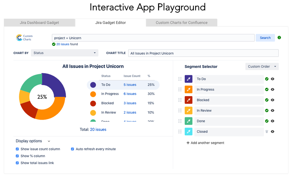
This is a simple app that allows you to select the colors of your pie chart, change the order of the segments, and hide segments you don't want to see. Create professional custom pie charts on Jira dashboards that don't look like they've been made in MS paint on Windows 95...
The interactive demo playground shows you how it works without even installing the app: https://link.oldstreetsolutions.com/custom-charts-playground
We're adding new features all the time to this app, so any feedback on how to improve it would be appreciated.
There's also a companion Confluence app that has identical features so you can add high quality custom pie charts to your Confluence pages.
You must be a registered user to add a comment. If you've already registered, sign in. Otherwise, register and sign in.
Pie charts would be a great display to have side by side for each project. We would like to use Status but need to be able to select the color of each status in order to be consistent. This should not be hard and the customer should not have to change the code to do this.
This would make the pie chart a useful tool for management to get a quick glance at the statuses of multiple projects with standard colors like red, yellow, and green.
You must be a registered user to add a comment. If you've already registered, sign in. Otherwise, register and sign in.
This was posted in 2012, why 7 years later are we stuck with a nearly useless pie chart like something out of the 80s.
Does Atlassian read these threads?
Is there a feature requests issue languishing somewhere?
Wait I found a bunch https://jira.atlassian.com/issues/?jql=type%20%3D%20Suggestion%20AND%20statusCategory%20!%3D%20Done%20and%20summary%20~%20%22pie%20chart%22%20%20order%20by%20created&startIndex=50
Upvote and comment on this one
You must be a registered user to add a comment. If you've already registered, sign in. Otherwise, register and sign in.
I'm seeking the same assistance.
It is frustrating to have four pie charts with different colours for same status across all.
PowerReport add-on is not available for Cloud: https://marketplace.atlassian.com/plugins/com.valiantys.jira.plugins.reporting
You must be a registered user to add a comment. If you've already registered, sign in. Otherwise, register and sign in.
Bruno + Brent – agreed, this is annoying, no resolution I take it? It makes it basically impossible to compare pie charts
You must be a registered user to add a comment. If you've already registered, sign in. Otherwise, register and sign in.
You must be a registered user to add a comment. If you've already registered, sign in. Otherwise, register and sign in.
Same here - Changing colours as things get closed out is possibly even more annoying than not matching across pie charts. Please allow us to choose colours, or at least a sort order or something for colours?
You must be a registered user to add a comment. If you've already registered, sign in. Otherwise, register and sign in.
We need to set colors in a pie chart to reflect tickets by Priority, so that colors always remain the same for the priorities, as follows:
- P0 - Blocker Emergency (always RED)
- P1 - Critical/High (always ORANGE)
- P2 - Major/Medium (always BLUE)
- P3- Minor/Low (always GREEN)
- P4 - Trivial (always GRAY)
You must be a registered user to add a comment. If you've already registered, sign in. Otherwise, register and sign in.
You must be a registered user to add a comment. If you've already registered, sign in. Otherwise, register and sign in.
Just started using pie charts on a large programme and the different colours issues is very confusing. Would really like a way to set colours please.
You must be a registered user to add a comment. If you've already registered, sign in. Otherwise, register and sign in.
I see you're looking into this too, DJ. Seems to be based on relative sizes. From what I've heard currently a commercial license is needed to modify the gadget code.
You must be a registered user to add a comment. If you've already registered, sign in. Otherwise, register and sign in.
It's simple to chose the color of your pie charts in Jira with this confluence add-on.
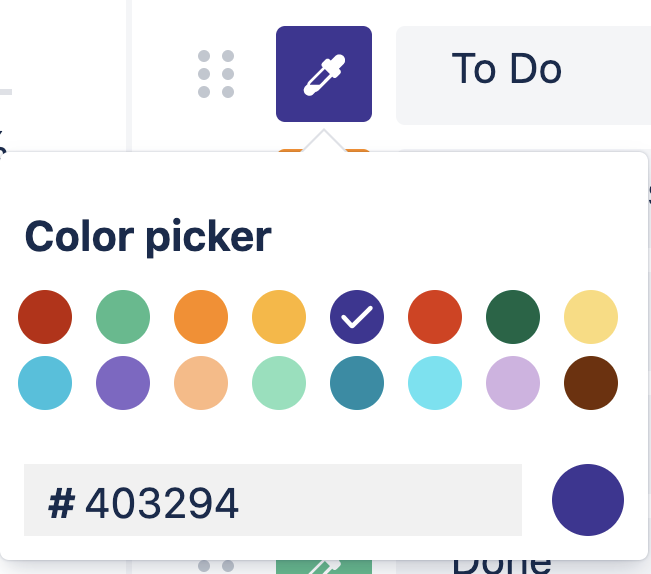
It's very easy to use the color picker, so your charts can be consistent.
You can even use HEX codes if needed.
Let me know how you get on with it, it should help!
There's even a demo playground to get a feel for it.
It's currently a Confluence add-on, but the Jira only version is coming soon.
You must be a registered user to add a comment. If you've already registered, sign in. Otherwise, register and sign in.
You must be a registered user to add a comment. If you've already registered, sign in. Otherwise, register and sign in.
Hey Bill, the Jira Server and Data Center version is now available on the Atlassian Marketplace: https://marketplace.atlassian.com/apps/1220925/custom-charts-for-jira
The Cloud version will be launching in September 2019 :)
You must be a registered user to add a comment. If you've already registered, sign in. Otherwise, register and sign in.
Is there no chance, that atlassian will fix this issue in the native Jira Pie-Charts for Confluence? Should be no big Deal I guess and I am facing this issue in every Software Company I've worked in.
You must be a registered user to add a comment. If you've already registered, sign in. Otherwise, register and sign in.
You must be a registered user to add a comment. If you've already registered, sign in. Otherwise, register and sign in.
We're finding this really frustrating too. Devs getting particularly annoyed that "Done" is sometimes blue, or even red. Whilst the more logical green is used for something else.
It also means we can't run comparisons across our development teams - to at least gauge progress through our sprint.
You must be a registered user to add a comment. If you've already registered, sign in. Otherwise, register and sign in.
You must be a registered user to add a comment. If you've already registered, sign in. Otherwise, register and sign in.
I have the same problem and this is extremely annoying, is there any news about a fix? I am using jira 7.12.1
You must be a registered user to add a comment. If you've already registered, sign in. Otherwise, register and sign in.

Was this helpful?
Thanks!
TAGS
Community showcase
Atlassian Community Events
- FAQ
- Community Guidelines
- About
- Privacy policy
- Notice at Collection
- Terms of use
- © 2024 Atlassian


You must be a registered user to add a comment. If you've already registered, sign in. Otherwise, register and sign in.