Create Sign up Log in
Turn on suggestions
Auto-suggest helps you quickly narrow down your search results by suggesting possible matches as you type.
Showing results for
Community resources
Community resources
- Community
- Products
- Jira Software
- Questions
- What Gadget can be used to build charts based on the Xray Test Results for several test phases
What Gadget can be used to build charts based on the Xray Test Results for several test phases
Hi,
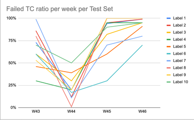
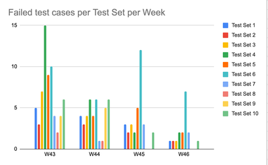
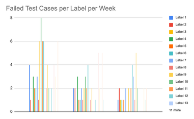
I am inexperienced in Jira + Xray, but I am asked to build charts covering test results upon test phases (e.g., weekly) based on Tests sets or labels to see what modules (= labels) cause the problems every time. I've found the way to build such charts for separate test phases, but cannot find the way to bring all the results together in one chart. Is there any widget available in Cloud Jira/Xray?
here are the charts which I used in Excel to get the necessary statistics

Regards,
Natalia
0 answers
DEPLOYMENT TYPE
CLOUDCommunity showcase
Atlassian Community Events
- FAQ
- Community Guidelines
- About
- Privacy policy
- Notice at Collection
- Terms of use
- © 2024 Atlassian


