Community resources
Community resources
- Community
- Products
- Jira Software
- Questions
- I am trying to view the burnt down chart using Remaining Estimates, but I am not able to interpret a
I am trying to view the burnt down chart using Remaining Estimates, but I am not able to interpret a
I am trying to view the burnt down chart using Remaining Estimates, but I am not able to interpret and seeking clarification.
1 answer
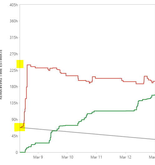
I am trying to interpret this graph. The starting point for grey line Vs. red line.
You must be a registered user to add a comment. If you've already registered, sign in. Otherwise, register and sign in.
The starting point for the grey line is based on the team's sprint capacity that you would have setup, in this case, seems to be around 65 hours (approximately).
The Red line is the sum of 'original estimates' from all the issues that are part of the sprint, which in this case looks like, far exceed team's capacity. Also, the little dents in the red vertical line is indicative of a sprint planning day, wherein team members were incrementally adding tasks and corresponding original estimates on each of the tasks throughout the day.
Now this is where it gets interesting: the green line is the hours logged by team members on their activities through the sprint, which indicates that the team has the required capacity to deliver the planned work.
This leaves us with one conclusion, that the Team's sprint capacity needs to be increased and ideally, the grey line should be at the same level as where the red line peaks before it trends downwards. Now this conclusion is based on the fact that the red line peaked within a day. If it had peaked over several days, it would have been indicative of scope added after sprint had started and more details would be required to interpret what was going on; but that is for another day.
Hope this helps.
You must be a registered user to add a comment. If you've already registered, sign in. Otherwise, register and sign in.

Was this helpful?
Thanks!
DEPLOYMENT TYPE
CLOUDPRODUCT PLAN
STANDARDPERMISSIONS LEVEL
Site AdminCommunity showcase
Atlassian Community Events
- FAQ
- Community Guidelines
- About
- Privacy policy
- Notice at Collection
- Terms of use
- © 2024 Atlassian


You must be a registered user to add a comment. If you've already registered, sign in. Otherwise, register and sign in.