Community resources
Community resources
- Community
- Products
- Jira Software
- Questions
- Can you remove/hide the Status section (New Issue UI)
Can you remove/hide the Status section (New Issue UI)
Hi
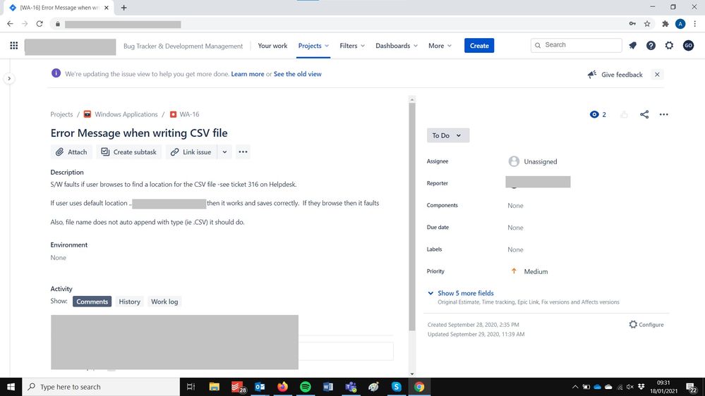
On my screen the Status section in the new UI still absorbs 40% of the right hand side of the screen.
You can hide the projects list on the left with the '<' button, is there a way to hide or (please !!!) shrink the status section on the right?
Gary
2 answers
1 accepted

Double checked in my cloud instance I think to recognize what you mean but it does not consume that much space on my screen.
It probably depends on screen size, screen resolution and/or zoom factor of the browser.
In case you could say something how your setup looks like the one or another factor could come to somebody's mind - for example is it a smaller laptop screen or a monitor (bigger size) attached to the PC. It will make a difference in total.
Probably you also could attach an anonymized screenshot for better understanding where the space consumption comes from?
Hi,
Thanks for your comments. I have attached a cut from my screen - this is full screen of a laptop at 1920x1080
You must be a registered user to add a comment. If you've already registered, sign in. Otherwise, register and sign in.

I was able to reproduce it on my laptop using the resolution you have mentioned, many thanks!
I also were able to identify a Suggestion on a better handling of the screen space:
https://jira.atlassian.com/browse/JRACLOUD-67884
There is also a longer discussion linked in this Suggestion:
https://community.atlassian.com/t5/Jira-discussions/New-Jira-Experience-Max-Width-Issue-View/m-p/663284
Starting off this base of information I believe configuration on your end is okay but the overall handling of user element/user experience could be improved which is hopefully done by a processing of JRACLOUD-67884 (you also could vote for it to signalize it is of importance to you!).
You must be a registered user to add a comment. If you've already registered, sign in. Otherwise, register and sign in.
Thanks - I will do. Given an acceptable way of moving the Left hand side out of the way ('>') , it seems a shame they didn't do the same thing for the RHS.
Thanks for your help & insight.
You must be a registered user to add a comment. If you've already registered, sign in. Otherwise, register and sign in.

i'm not sure what makes up the "status section" and which screen exactly you are looking at but my guess is you are looking at the detail issue view and talking about the right hand column where your context fields are listed. The limit of configuration is presented in the layout screen which can be accessed by clicking on "Configure" icon at the bottom of that column.
You must be a registered user to add a comment. If you've already registered, sign in. Otherwise, register and sign in.
Hi - yes you are right, it was the RH column with its acres of white space.
Thanks for the excellent tip - I have removed all of the fields on the right and put the useful ones (e.g assignee) on the left. Now I am left with just Status (e.g. "In Review" on its own on the right. This seems to be immovable :-(
i.e. I want the status field and assignee field, just not to have them wasting half the screen (well 40% of it anyways)
So I'll probably end up putting them all back as I have not been able t regain any screen real estate.
You must be a registered user to add a comment. If you've already registered, sign in. Otherwise, register and sign in.

Was this helpful?
Thanks!
DEPLOYMENT TYPE
CLOUDPRODUCT PLAN
FREEPERMISSIONS LEVEL
Site AdminCommunity showcase
Atlassian Community Events
- FAQ
- Community Guidelines
- About
- Privacy policy
- Notice at Collection
- Terms of use
- © 2024 Atlassian


You must be a registered user to add a comment. If you've already registered, sign in. Otherwise, register and sign in.