Community resources
Community resources
- Community
- Products
- Jira Service Management
- Discussions
- New issue view quirks
New issue view quirks
There are many such as the excessive padding around all the text, vertical panes and scroll bars for days, no color to visually distinguish sections of the view, etc. etc.
I know the new issue view is here to stay and the changes coming will only improve on the building blocks - hey I am all for it and looking forward to it.
But this one quirk I just came across really got to me:
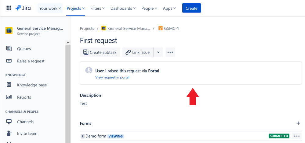
I created company-managed service management project, and submitted a test request. I noticed that this blob front and center of the request. See screenshot below:
I went back to a team-managed service management project that I created earlier and it had the same thing BUT it at least had the description field included in the same box area, so it kind of made sense.
First of all, why do you need that info at first glance? And WHY do I need to view the request in portal when I am already viewing it here???
This is one of those things that can easily fit into the "Details" section on the right side, as it was before in the old issue view.
It doesn't add any further value to the request by being the first thing you see on the request and wastes precious screen space in an already busy issue view that looks like a giant wall of text.
Sorry for the rant, I have been trying to get used to the new issue view but this just got to me.
0 comments
Was this helpful?
Thanks!
TAGS
Atlassian Community Events
- FAQ
- Community Guidelines
- About
- Privacy policy
- Notice at Collection
- Terms of use
- © 2024 Atlassian


