Community resources
Community resources
- Community
- Products
- Jira Service Management
- Questions
- How can i create a report of service tickets opened by label
2 answers

Hi @nielr ,
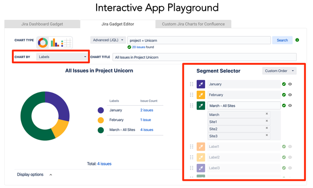
This problem was bothering me as well, so I've built an app with my team to help create charts with labels more easily called Custom Charts for Jira.
You're able to chart by labels, hide any you don't want to see, and usefully for your example, you can group multiple labels together.
You can check out the app right now on our interactive app playground and see for yourself how it works: https://www.oldstreetsolutions.com/custom-charts-for-jira
There's also a Confluence version of Custom Charts if you want better-looking charting in Confluence :)
We're adding new chart types and features all the time, so let me know if there's anything missing that you're looking for.
Thanks
Tom
Custom Charts Product Manager
Hi Tom,
I'm trying to install the software but I can't figure out how/where to find the Admin>Add Ons your doc talks about. I don't have an add ons menu in my admin screen. I've "installed" the software through Atlassian marketplace but it doesn't appear anywhere in the software for me at all. Any ideas?
You must be a registered user to add a comment. If you've already registered, sign in. Otherwise, register and sign in.

Hi @nielr
Once you've installed the app from the Marketplace it should be available to you on your instance.
If you're using Jira you can add a Custom Chart to a dashboard. Here's a link to our documentation showing how to do that: https://ossapps.atlassian.net/wiki/spaces/CCFJ/pages/255689248/User+s+Guide
If you're using Confluence you can add a Custom Chart to any page using the Custom Jira Charts macro. Here's a link to our documentation showing how to do that: https://ossapps.atlassian.net/wiki/spaces/CCFC/pages/59277871/User+s+Guide
If you have any other questions about the app you can raise a ticket in our support portal where I'll be able to reply to you directly: https://ossapps.atlassian.net/servicedesk/customer/portals
I hope that helps with what you're looking for :)
Kind regards,
Tom
You must be a registered user to add a comment. If you've already registered, sign in. Otherwise, register and sign in.

You can create a dashboard and use a pie chart by labels. However if you have a lot of labels it will become unwieldy.
You must be a registered user to add a comment. If you've already registered, sign in. Otherwise, register and sign in.
Thanks!
This is the exact problem we have because Jira thinks each combo of label is a unique label attribute (e.g. a ticket with "dog" "cat" "farm" labels has a unique "dog cat farm" label when reporting). Seems like a really basic thing you'd want to do with tickets. Are their other reporting solutions that solve this problem or give good basic reporting insights?
You must be a registered user to add a comment. If you've already registered, sign in. Otherwise, register and sign in.

Yep if you have multiple labels it will not work. You would need an addon like EasyBi I think or export to Excel and post process.
You must be a registered user to add a comment. If you've already registered, sign in. Otherwise, register and sign in.

Was this helpful?
Thanks!
Atlassian Community Events
- FAQ
- Community Guidelines
- About
- Privacy policy
- Notice at Collection
- Terms of use
- © 2024 Atlassian


You must be a registered user to add a comment. If you've already registered, sign in. Otherwise, register and sign in.