Community resources
Community resources
- Community
- Products
- Jira Software
- Questions
- Historical Created vs Resolved chart
Historical Created vs Resolved chart
We use a created vs resolved chart to track incoming and fixed bugs leading up to a release. Works great.
My issue is that months (or even years) *after* the release goes out, I would like to view the created vs resolved chart and see how the curves looked leading up to the release day.
Sadly, the curves have all 'aged out'.
It would be awesome to be able to specify a range of dates for this chart - so we could fix it for releases that are in the past, and then compare them (side by side) to see how quickly we were finding/fixing bugs in this release compared to the previous one(s).
1 answer

Hi @Ken Jessen ,
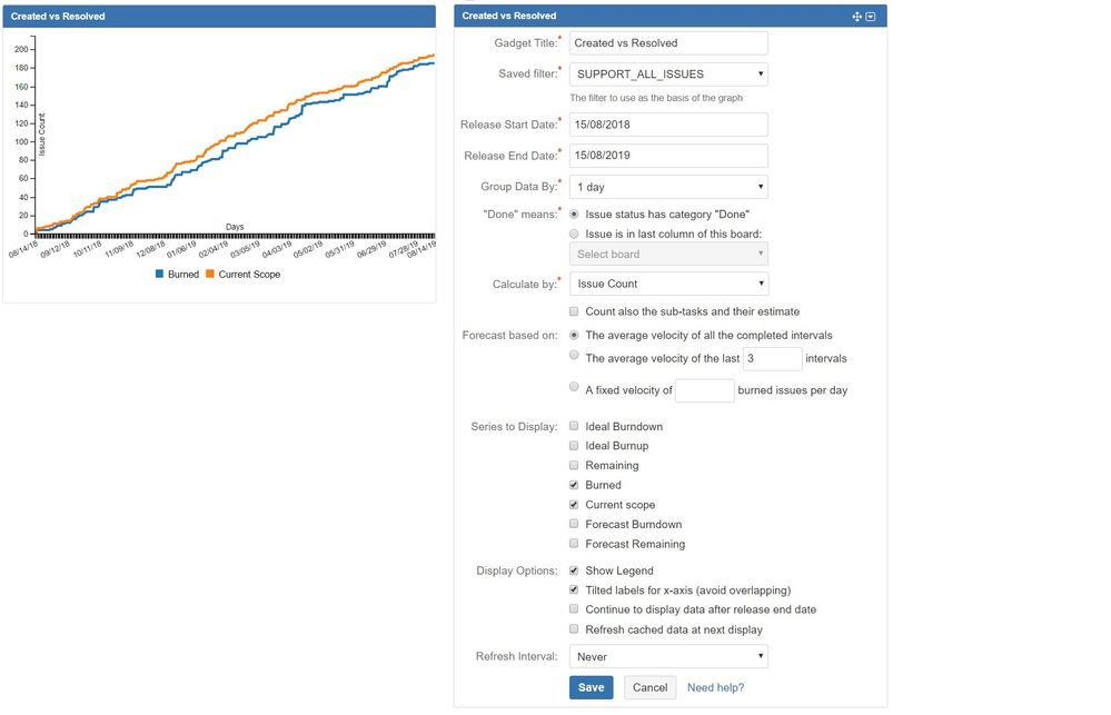
With our add-ons Great Gadgets for Jira Server and Great Gadgets for Jira Cloud you can have a Created vs Resolved chart on your dashboard that allows selecting a time range.
In the 10 gadgets offered by the add-on, there is a Release Burndown / Burnup Chart gadget than can be easily configured as Created vs Resolved Chart. Just take a look at this example.
Danut

Was this helpful?
Thanks!
Community showcase
Atlassian Community Events
- FAQ
- Community Guidelines
- About
- Privacy policy
- Notice at Collection
- Terms of use
- © 2024 Atlassian


You must be a registered user to add a comment. If you've already registered, sign in. Otherwise, register and sign in.