Create Sign up Log in
Turn on suggestions
Auto-suggest helps you quickly narrow down your search results by suggesting possible matches as you type.
Showing results for
Community resources
Community resources
- Community
- Products
- Confluence
- Questions
- How can I convert my 'Column' graph to a 'Line' graph
How can I convert my 'Column' graph to a 'Line' graph
I have a 2x13 table, the 1st column's header is 'Month' and the values in the column are the months from Jan to Dec, the second column's header is 'Sales' and there are numerical values in the rest of it. Using the ‘Chart from Table’ macro, I can see a 'Column' graph (as well as a 'Donut' graph) but I want to see my chart as a 'Line' graph and this doesn't work, I get the message 'Probably, there is no data in the Values column. Please, select the column with data values for chart generation'.
Any ideas?
1 answer
1 accepted
Andrey Khaneev _StiltSoft_
Rising Star 
April 15, 2020 edited 
Rising Star
Rising Stars are recognized for providing high-quality answers to other users. Rising Stars receive a certificate of achievement and are on the path to becoming Community Leaders.
Hi Dimitri,
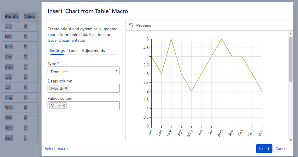
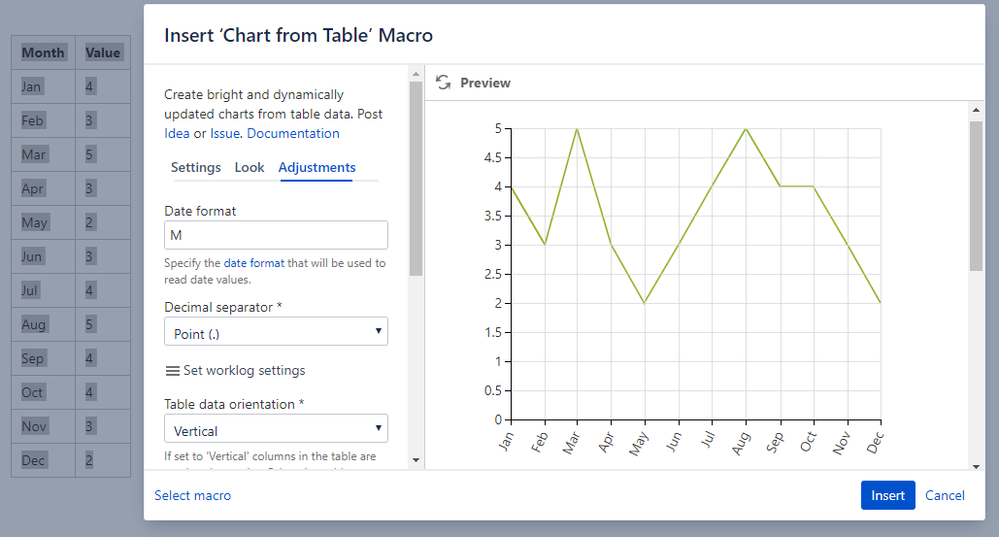
Please, select the Time Line type instead of the Line type and set the date format to M:
You must be a registered user to add a comment. If you've already registered, sign in. Otherwise, register and sign in.

Was this helpful?
Thanks!
- FAQ
- Community Guidelines
- About
- Privacy policy
- Notice at Collection
- Terms of use
- © 2024 Atlassian


You must be a registered user to add a comment. If you've already registered, sign in. Otherwise, register and sign in.