Create
cancel
Showing results for 
Search instead for 
Did you mean: 
Sign up Log in

Calling all Confluence Cloud users! Give us feedback on a new navigation concept.

[EDIT - November 12, 2019]

Hi everyone!

Thank you all for your interest and time in trying out our navigation prototype. I'm pleased to announce that our teams have been building it! We'll start rolling out the real thing in a few weeks. You can find more details here:

https://community.atlassian.com/t5/Confluence-articles/New-navigation-and-Home-are-coming-to-Confluence-Cloud/ba-p/1211418


~~~~~~~~~~~~~~~~~~~~~~~~~~~~~~~~~~~~~~~~~~~~~~~~~~~~~~~~~~~~~

Hi everyone!

I'm Elaine. I’m a product manager for Confluence Cloud.

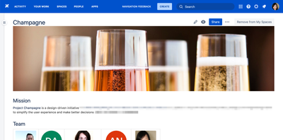
We’ve been working on a few initiatives to improve your experience with navigating in Confluence. We are excited to announce that the prototype of a new navigation experience is ready for you to try today.

Screenshot with top nav.png


What do you need to get started?

To be eligible for this prototype you'll need to:

  1. Be a user of Confluence (Cloud version only)
  2. Use Google Chrome as your internet browser


Instructions

All you need is to install our Atlassian Navigation Prototype Chrome Extension on your Chrome browser. Once you're done, go to your Confluence as usual and refresh your page if needed. That's it!


What will happen?

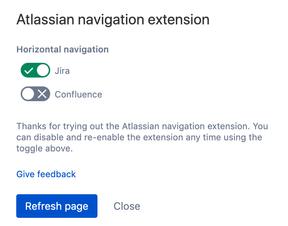
Navigating in Confluence now will use our new navigation prototype. Everything should work as it used to and you can keep using Confluence as normal. Please note that if you are also a Jira Cloud user, you can toggle on/off a similar experience for Jira.


We need your feedback!

We'd love your input to shape the future of Confluence Cloud together. If you have any general feedback, bug reports, ideas or suggestions, we'd love to hear from you! Simply click the "Navigation Feedback" button in the navigation and your feedback will go straight to us!

nav_feedback.png


Disabling the Chrome extension

If for any reason you want to disable this Chrome extension, you can remove it or simply disable it from your Chrome extension's menu at any time.

Chrome extension.png


Thank you for your time. Feel free to leave comments below or submit in-product feedback.

10 comments

Davin Studer
Rising Star
Rising Star
Rising Stars are recognized for providing high-quality answers to other users. Rising Stars receive a certificate of achievement and are on the path to becoming Community Leaders.
July 25, 2019

I've never been fond of the cloud left hand navigation bar. This brings back the familiar top nav bar, with a few changes, but for the most part it works like it used it. I feel like I've gotten back a long lost friendship.

Like # people like this
Nic Brough -Adaptavist-
Community Leader
Community Leader
Community Leaders are connectors, ambassadors, and mentors. On the online community, they serve as thought leaders, product experts, and moderators.
July 25, 2019

Just pointed one of my smaller clients to this (because they've been complaining about being able to find functions since migrating to Cloud a few months ago).  Ok, only 18 users, but in the space of an hour, 5 of them have come back with "this works" and requests for it to work in other browsers!

Like Sofia Pandelea likes this
James Dellow
Community Leader
Community Leader
Community Leaders are connectors, ambassadors, and mentors. On the online community, they serve as thought leaders, product experts, and moderators.
July 25, 2019

My thoughts are exactly the same as @Davin Studer

I realise there is currently a trend towards having a left-hand navigation in other competing wiki-like products and some other collaboration tools I'm familiar with. A primary left-hand nav may also work better for other parts of the Atlassian stack (e.g. I think it works quite well in Bitbucket).

But for Confluence, which is all about content organised in pages in spaces, the top navigation just makes it easier to use. I've also worked on many intranet projects using other CMS that have tried and failed to use a left-hand navigation as the primary navigation.

Obviously the challenge for Cloud is creating a cohesive UI system that link each part together, but I don't believe it needs to be homogenous across all the products.

Maybe I'm also being biased, but I think when my app (News for Confluence Cloud) is used as the dashboard it also looks much better on a page without the left-hand navigation 😀.

PS you just need something better to replace waffle icon - they are notoriously bad for usability.

Like # people like this
Lucy Minato July 28, 2019

I agree that the left panel for navigation between pages in a space and top panel for the “doing stuff” menu is good. I think it’s less confusing with only one panel on the left – navigation on the left and main menu on the top.

After a bit of testing, my feedback (so far) is that I now question the choice of options in the top menu for non-logged in users. I don’t think they should have the "Your Work", "People" or "Create" options, these should only be available once a user is logged in. (I’ve only just noticed that there is the “Create” button in the current Confluence for non-logged in users.)

Like James Dellow likes this
Helen Griffith July 28, 2019

A very quick first glance, this looks better. It reduces the clutter in the left-hand navigation, leaving that for one thing—page navigation—only.

And as I type, I see that my next comment is exactly the same as @Lucy Minato's above! Anonymous users shouldn't see anything they can't use. In my case, all anonymous users can do is switch between two spaces. 

Like James Dellow likes this
Helen Griffith July 29, 2019

Another issue I've found.

To top bar hides the Edit | Save | Watch | etc. buttons when I scroll down a page. I can see the bottom one or two pixels, and can click on those pixels to edit the page for example, but it's not much use if you're not familiar with the buttons and their location!

Jack Brickey
Community Leader
Community Leader
Community Leaders are connectors, ambassadors, and mentors. On the online community, they serve as thought leaders, product experts, and moderators.
August 16, 2019

I prefer the LH sidebar and definitely want it to stay. If you want to make it configurable so people can choose that would be fine but I would not be in favor of switching back. I like that I can now collapse the sidebar to regain screen if needed.

Cody Stevens
Rising Star
Rising Star
Rising Stars are recognized for providing high-quality answers to other users. Rising Stars receive a certificate of achievement and are on the path to becoming Community Leaders.
August 23, 2019

I'm trying to decide which one I like better and it's honestly pretty tough. I have been working almost exclusively in server for the last 3 months so it's nice to have a similar layout in cloud. 

I think the left-hand sidebar is more aesthetically pleasing because of the simple icons without text and the general size of the navbar. It's clean and easy to use once you have it down. However, the new navbar has quicker access to things like projects and dashboards. 

Overall, I would say this navigation bar should be fully integrated into the cloud. I do think it should be a toggle option though. I don't think this should replace the other navbar. For new users, you could have them configure this when they are logging in for the first time. For already existing users, it could be in their personal settings. 

Lucy Minato November 6, 2019

I've just noticed that I can't view the history of a page when I use the Atlassian Navigation Extension and I use the horizontal navigation. I get the "Page History" option at the top right under the ellipsis but if I click I just get a blank page. Anyone else getting this same behaviour? 

Tal Levi November 18, 2019

Hey @Elaine H. :)

Love the new navigation, but I've come across a few bugs and I can't seem to find the feedback button mentioned above:

1. Pressing the / key opens the search in the left side of the screen, while on click it opens to the right - It's weird.

2. Projects didn't load for me a few times

3. There's another scroll that's a bit annoying:

image.png


Comment

Log in or Sign up to comment
TAGS
AUG Leaders

Atlassian Community Events